Count-Based Differential Expression Analysis of RNA-seq Data
This is an introduction to RNAseq analysis involving reading in quantitated gene expression data from an RNA-seq experiment, exploring the data using base R functions and then analysis with the DESeq2 package. This lesson assumes a basic familiarity with R, data frames, and manipulating data with dplyr and %>%. See also the Bioconductor heading on the setup page – you’ll need a few additional packages that are available through Bioconductor, not CRAN (the installation process is slightly different).
Recommended reading prior to class:
- Conesa et al. A survey of best practices for RNA-seq data analysis. Genome Biology 17:13 (2016).
- Soneson et al. “Differential analyses for RNA-seq: transcript-level estimates improve gene-level inferences.” F1000Research 4 (2015).
- Abstract and introduction sections of Himes et al. “RNA-Seq transcriptome profiling identifies CRISPLD2 as a glucocorticoid responsive gene that modulates cytokine function in airway smooth muscle cells.” PLoS ONE 9.6 (2014): e99625.
Slides: click here.
Review
Prerequsite skills
Data needed
- Length-scaled count matrix (i.e.,
countData): airway_scaledcounts.csv - Sample metadata (i.e.,
colData): airway_metadata.csv - Gene Annotation data: annotables_grch38.csv
Background
The biology
The data for this lesson comes from:
Himes et al. “RNA-Seq Transcriptome Profiling Identifies CRISPLD2 as a Glucocorticoid Responsive Gene that Modulates Cytokine Function in Airway Smooth Muscle Cells.” PLoS ONE. 2014 Jun 13;9(6):e99625. PMID: 24926665.
Glucocorticoids are potent inhibitors of inflammatory processes, and are widely used to treat asthma because of their anti-inflammatory effects on airway smooth muscle (ASM) cells. But what’s the molecular mechanism? This study used RNA-seq to profile gene expression changes in four different ASM cell lines treated with dexamethasone, a synthetic glucocorticoid molecule. They found a number of differentially expressed genes comparing dexamethasone-treated ASM cells to control cells, but focus much of the discussion on a gene called CRISPLD2. This gene encodes a secreted protein known to be involved in lung development, and SNPs in this gene in previous GWAS studies are associated with inhaled corticosteroid resistance and bronchodilator response in asthma patients. They confirmed the upregulated CRISPLD2 mRNA expression with qPCR and increased protein expression using Western blotting.
They did their analysis using Tophat and Cufflinks. We’re taking a different approach and using an R package called DESeq2. Click here to read more on DESeq2 and other approaches.
Data pre-processing
Analyzing an RNAseq experiment begins with sequencing reads. There are many ways to begin analyzing this data, and you should check out the three papers below to get a sense of other analysis strategies. In the workflow we’ll use here, sequencing reads were pseudoaligned to a reference transcriptome and the abundance of each transcript quantified using kallisto (software, paper). Transcript-level abundance estimates were then summarized to the gene level to produce length-scaled counts using txImport (software, paper), suitable for using in count-based analysis tools like DESeq. This is the starting point - a “count matrix,” where each cell indicates the number of reads mapping to a particular gene (in rows) for each sample (in columns). This is one of several potential workflows, and relies on having a well-annotated reference transcriptome. However, there are many well-established alternative analysis paths, and the goal here is to provide a reference point to acquire fundamental skills that will be applicable to other bioinformatics tools and workflows.
- Conesa, A. et al. “A survey of best practices for RNA-seq data analysis.” Genome Biology 17:13 (2016).
- Soneson, C., Love, M. I. & Robinson, M. D. “Differential analyses for RNA-seq: transcript-level estimates improve gene-level inferences.” F1000Res. 4:1521 (2016).
- Griffith, Malachi, et al. “Informatics for RNA sequencing: a web resource for analysis on the cloud.” PLoS Comput Biol 11.8: e1004393 (2015).
This data was downloaded from GEO (GSE:GSE52778). You can read more about how the data was processed by going over the slides. If you’d like to see the code used for the upstream pre-processing with kallisto and txImport, see the code.
Data structure
We’ll come back to this again later, but the data at our starting point looks like this (note: this is a generic schematic - our genes are not actually geneA and geneB, and our samples aren’t called ctrl_1, ctrl_2, etc.):
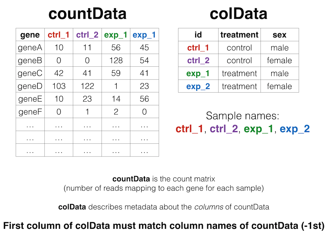
That is, we have two tables:
- The “count matrix” (called the
countDatain DESeq-speak) – where genes are in rows and samples are in columns, and the number in each cell is the number of reads that mapped to exons in that gene for that sample: airway_scaledcounts.csv. - The sample metadata (called the
colDatain DESeq-speak) – where samples are in rows and metadata about those samples are in columns: airway_metadata.csv. It’s called thecolDatabecause this table supplies metadata/information about the columns of thecountDatamatrix. Notice that the first column ofcolDatamust match the column names ofcountData(except the first, which is the gene ID column).1
Import data
First, let’s load the tidyverse library. (This loads readr, dplyr, ggplot2, and several other needed packages). Then let’s import our data with readr’s read_csv() function (note: not read.csv()). Let’s read in the actual count data and the experimental metadata.
library(tidyverse)

mycounts <- read_csv("data/airway_scaledcounts.csv")
metadata <-  read_csv("data/airway_metadata.csv")
Now, take a look at each.
mycounts## # A tibble: 38,694 x 9
## ensgene SRR1039508 SRR1039509 SRR1039512 SRR1039513 SRR1039516
## <chr> <dbl> <dbl> <dbl> <dbl> <dbl>
## 1 ENSG00000000003 723 486 904 445 1170
## 2 ENSG00000000005 0 0 0 0 0
## 3 ENSG00000000419 467 523 616 371 582
## 4 ENSG00000000457 347 258 364 237 318
## 5 ENSG00000000460 96 81 73 66 118
## 6 ENSG00000000938 0 0 1 0 2
## 7 ENSG00000000971 3413 3916 6000 4308 6424
## 8 ENSG00000001036 2328 1714 2640 1381 2165
## 9 ENSG00000001084 670 372 692 448 917
## 10 ENSG00000001167 426 295 531 178 740
## # ... with 38,684 more rows, and 3 more variables: SRR1039517 <dbl>,
## # SRR1039520 <dbl>, SRR1039521 <dbl>metadata## # A tibble: 8 x 4
## id dex celltype geo_id
## <chr> <chr> <chr> <chr>
## 1 SRR1039508 control N61311 GSM1275862
## 2 SRR1039509 treated N61311 GSM1275863
## 3 SRR1039512 control N052611 GSM1275866
## 4 SRR1039513 treated N052611 GSM1275867
## 5 SRR1039516 control N080611 GSM1275870
## 6 SRR1039517 treated N080611 GSM1275871
## 7 SRR1039520 control N061011 GSM1275874
## 8 SRR1039521 treated N061011 GSM1275875Notice something here. The sample IDs in the metadata sheet (SRR1039508, SRR1039509, etc.) exactly match the column names of the countdata, except for the first column, which contains the Ensembl gene ID. This is important, and we’ll get more strict about it later on.
Poor man’s DGE
Let’s look for differential gene expression. Note: this analysis is for demonstration only. NEVER do differential expression analysis this way!
Let’s start with an exercise.
Exercise 1
If we look at our metadata, we see that the control samples are SRR1039508, SRR1039512, SRR1039516, and SRR1039520. This bit of code will take the mycounts data, mutate() it to add a column called controlmean, then select() only the gene name and this newly created column, and assigning the result to a new object called meancounts. (Hint: mycounts %>% mutate(...) %>% select(...))
meancounts <- mycounts %>%
  mutate(controlmean = (SRR1039508+SRR1039512+SRR1039516+SRR1039520)/4) %>%
  select(ensgene, controlmean)
meancounts
## # A tibble: 38,694 x 2
## ensgene controlmean
## <chr> <dbl>
## 1 ENSG00000000003 900.75
## 2 ENSG00000000005 0.00
## 3 ENSG00000000419 520.50
## 4 ENSG00000000457 339.75
## 5 ENSG00000000460 97.25
## 6 ENSG00000000938 0.75
## 7 ENSG00000000971 5219.00
## 8 ENSG00000001036 2327.00
## 9 ENSG00000001084 755.75
## 10 ENSG00000001167 527.75
## # ... with 38,684 more rows- Build off of this code,
mutate()it once more (prior to theselect()) function, to add another column calledtreatedmeanthat takes the mean of the expression values of the treated samples. Thenselect()only theensgene,controlmeanandtreatedmeancolumns, assigning it to a new object called meancounts.
## # A tibble: 38,694 x 3
##            ensgene controlmean treatedmean
##              <chr>       <dbl>       <dbl>
##  1 ENSG00000000003      900.75       658.0
##  2 ENSG00000000005        0.00         0.0
##  3 ENSG00000000419      520.50       546.0
##  4 ENSG00000000457      339.75       316.5
##  5 ENSG00000000460       97.25        78.8
##  6 ENSG00000000938        0.75         0.0
##  7 ENSG00000000971     5219.00      6687.5
##  8 ENSG00000001036     2327.00      1785.8
##  9 ENSG00000001084      755.75       578.0
## 10 ENSG00000001167      527.75       348.2
## # ... with 38,684 more rows- Directly comparing the raw counts is going to be problematic if we just happened to sequence one group at a higher depth than another. Later on we’ll do this analysis properly, normalizing by sequencing depth per sample using a better approach. But for now,
summarize()the data to show thesumof the mean counts across all genes for each group. Your answer should look like this:
## # A tibble: 1 x 2
##   `sum(controlmean)` `sum(treatedmean)`
##                <dbl>              <dbl>
## 1            2.3e+07           22196524
How about another?
Exercise 2
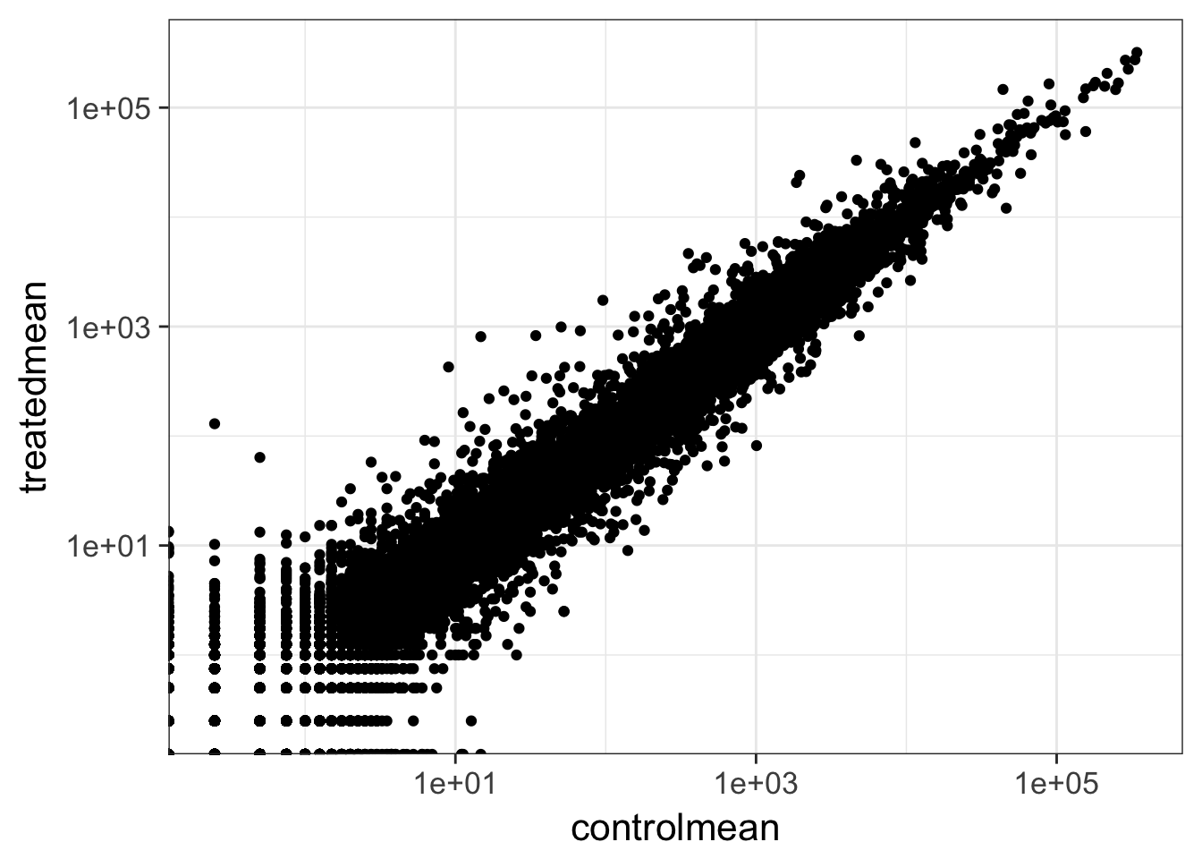
- Create a scatter plot showing the mean of the treated samples against the mean of the control samples.
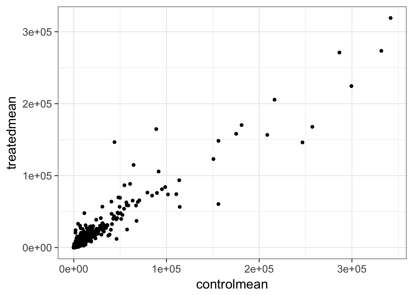
- Wait a sec. There are 60,000-some rows in this data, but I’m only seeing a few dozen dots at most outside of the big clump around the origin. Try plotting both axes on a log scale (hint:
... + scale_..._log10())
We can find candidate differentially expressed genes by looking for genes with a large change between control and dex-treated samples. We usually look at the \(log_2\) of the fold change, because this has better mathematical properties. On the absolute scale, upregulation goes from 1 to infinity, while downregulation is bounded by 0 and 1. On the log scale, upregulation goes from 0 to infinity, and downregulation goes from 0 to negative infinity. So, let’s mutate our meancounts object to add a log2foldchange column. Optionally pipe this to View().
meancounts %>% mutate(log2fc=log2(treatedmean/controlmean))There are a couple of “weird” results. Namely, the NaN (“not a number”) and -Inf (negative infinity) results. The NaN is returned when you divide by zero and try to take the log. The -Inf is returned when you try to take the log of zero. It turns out that there are a lot of genes with zero expression. Let’s filter our meancounts data, mutate it to add the \(log_2(Fold Change)\), and when we’re happy with what we see, let’s reassign the result of that operation back to the meancounts object. (Note: this is destructive. If you’re coding interactively like we’re doing now, before you do this it’s good practice to see what the result of the operation is prior to making the reassignment.)
# Try running the code first, prior to reassigning.
meancounts <- meancounts %>%
  filter(controlmean>0 & treatedmean>0) %>%
  mutate(log2fc=log2(treatedmean/controlmean))
meancounts
A common threshold used for calling something differentially expressed is a \(log_2(FoldChange)\) of greater than 2 or less than -2. Let’s filter the dataset both ways to see how many genes are up or down-regulated.
meancounts %>% filter(log2fc>2)
meancounts %>% filter(log2fc<(-2))
In total, we’ve got 617 differentially expressed genes, in either direction.
Exercise 3
Look up help on ?inner_join or Google around for help for using dplyr’s inner_join() to join two tables by a common column/key. You downloaded annotables_grch38.csv from the data downloads page. Load this data with read_csv() into an object called anno. Pipe it to View() or click on the object in the Environment pane to view the entire dataset. This table links the unambiguous Ensembl gene ID to things like the gene symbol, full gene name, location, Entrez gene ID, etc.
anno <- read_csv("data/annotables_grch38.csv")
anno
## # A tibble: 66,531 x 9
## ensgene entrez symbol chr start end strand
## <chr> <int> <chr> <chr> <int> <int> <int>
## 1 ENSG00000000003 7105 TSPAN6 X 100627109 100639991 -1
## 2 ENSG00000000005 64102 TNMD X 100584802 100599885 1
## 3 ENSG00000000419 8813 DPM1 20 50934867 50958555 -1
## 4 ENSG00000000457 57147 SCYL3 1 169849631 169894267 -1
## 5 ENSG00000000460 55732 C1orf112 1 169662007 169854080 1
## 6 ENSG00000000938 2268 FGR 1 27612064 27635277 -1
## 7 ENSG00000000971 3075 CFH 1 196651878 196747504 1
## 8 ENSG00000001036 2519 FUCA2 6 143494811 143511690 -1
## 9 ENSG00000001084 2729 GCLC 6 53497341 53616970 -1
## 10 ENSG00000001167 4800 NFYA 6 41072945 41099976 1
## # ... with 66,521 more rows, and 2 more variables: biotype <chr>,
## # description <chr>- Take our newly created
meancountsobject, andarrange()itdescending by the absolute value (abs()) of thelog2fccolumn. The first few rows should look like this:
## # A tibble: 3 x 4
##           ensgene controlmean treatedmean log2fc
##             <chr>       <dbl>       <dbl>  <dbl>
## 1 ENSG00000179593        0.25       129.5   9.02
## 2 ENSG00000277196        0.50        63.8   6.99
## 3 ENSG00000109906 14.75 808.8 5.78- Continue on that pipeline, and
inner_join()it to theannodata by theensgenecolumn. Either assign it to a temporary object or pipe the whole thing toViewto take a look. What do you notice? Would you trust these results? Why or why not?
## # A tibble: 21,995 x 12
##            ensgene controlmean treatedmean log2fc    entrez     symbol
##              <chr>       <dbl>       <dbl>  <dbl>     <int>      <chr>
##  1 ENSG00000179593        0.25      129.50   9.02       247    ALOX15B
##  2 ENSG00000277196        0.50       63.75   6.99 102724788 AC007325.2
##  3 ENSG00000109906       14.75      808.75   5.78      7704     ZBTB16
##  4 ENSG00000128285       12.75        0.25  -5.67      2847      MCHR1
##  5 ENSG00000171819        9.00      427.25   5.57     10218    ANGPTL7
##  6 ENSG00000137673        0.25       10.25   5.36      4316       MMP7
##  7 ENSG00000241713        0.25        7.25   4.86     58496     LY6G5B
##  8 ENSG00000277399        0.50       13.25   4.73    440435     GPR179
##  9 ENSG00000118729       25.50        1.00  -4.67       845      CASQ2
## 10 ENSG00000127954       34.25      826.75   4.59     79689     STEAP4
## # ... with 21,985 more rows, and 6 more variables: chr <chr>, start <int>,
## #   end <int>, strand <int>, biotype <chr>, description <chr>
DESeq2 analysis
DESeq2 package
Let’s do this the right way. DESeq2 is an R package for analyzing count-based NGS data like RNA-seq. It is available from Bioconductor. Bioconductor is a project to provide tools for analysing high-throughput genomic data including RNA-seq, ChIP-seq and arrays. You can explore Bioconductor packages here.
Bioconductor packages usually have great documentation in the form of vignettes. For a great example, take a look at the DESeq2 vignette for analyzing count data. This 40+ page manual is packed full of examples on using DESeq2, importing data, fitting models, creating visualizations, references, etc.
Just like R packages from CRAN, you only need to install Bioconductor packages once (instructions here), then load them every time you start a new R session.
library(DESeq2)
citation("DESeq2")
Take a second and read through all the stuff that flies by the screen when you load the DESeq2 package. When you first installed DESeq2 it may have taken a while, because DESeq2 depends on a number of other R packages (S4Vectors, BiocGenerics, parallel, IRanges, etc.) Each of these, in turn, may depend on other packages. These are all loaded into your working environment when you load DESeq2. Also notice the lines that start with The following objects are masked from 'package:.... One example of this is the rename() function from the dplyr package. When the S4Vectors package was loaded, it loaded it’s own function called rename(). Now, if you wanted to use dplyr’s rename function, you’ll have to call it explicitly using this kind of syntax: dplyr::rename(). See this Q&A thread for more.
Importing data
DESeq works on a particular type of object called a DESeqDataSet. The DESeqDataSet is a single object that contains input values, intermediate calculations like how things are normalized, and all results of a differential expression analysis. You can construct a DESeqDataSet from a count matrix, a metadata file, and a formula indicating the design of the experiment. See the help for ?DESeqDataSetFromMatrix. If you read through the DESeq2 vignette you’ll read about the structure of the data that you need to construct a DESeqDataSet object.
DESeqDataSetFromMatrix requires the count matrix (countData argument) to be a matrix or numeric data frame. either the row names or the first column of the countData must be the identifier you’ll use for each gene. The column names of countData are the sample IDs, and they must match the row names of colData (or the first column when tidy=TRUE). colData is an additional dataframe describing sample metadata. Both colData and countData must be regular data.frame objects – they can’t have the special tbl_df class wrapper created when importing with readr::read_*.
Let’s look at our mycounts and metadata again.
mycounts
metadata
class(mycounts)
class(metadata)
Remember, we read in our count data and our metadata using read_csv() which read them in as those “special” dplyr data frames / tbls. We’ll need to convert them back to regular data frames for them to work well with DESeq2.
mycounts <- as.data.frame(mycounts)
metadata <- as.data.frame(metadata)
head(mycounts)
head(metadata)
class(mycounts)
class(metadata)
Let’s check that the column names of our count data (except the first, which is ensgene) are the same as the IDs from our colData.
names(mycounts)[-1]
metadata$id
names(mycounts)[-1]==metadata$id
all(names(mycounts)[-1]==metadata$id)
Now we can move on to constructing the actual DESeqDataSet object. The last thing we’ll need to specify is a design – a formula which expresses how the counts for each gene depend on the variables in colData. Take a look at metadata again. The thing we’re interested in is the dex column, which tells us which samples are treated with dexamethasone versus which samples are untreated controls. We’ll specify the design with a tilde, like this: design=~dex. (The tilde is the shifted key to the left of the number 1 key on my keyboard. It looks like a little squiggly line). So let’s contruct the object and call it dds, short for our DESeqDataSet. If you get a warning about “some variables in design formula are characters, converting to factors” don’t worry about it. Take a look at the dds object once you create it.
dds <- DESeqDataSetFromMatrix(countData=mycounts,
                              colData=metadata,
                              design=~dex,
                              tidy=TRUE)
dds
DESeq pipeline
Next, let’s run the DESeq pipeline on the dataset, and reassign the resulting object back to the same variable. Before we start, dds is a bare-bones DESeqDataSet. The DESeq() function takes a DESeqDataSet and returns a DESeqDataSet, but with lots of other information filled in (normalization, dispersion estimates, differential expression results, etc). Notice how if we try to access these objects before running the analysis, nothing exists.
sizeFactors(dds)
dispersions(dds)
results(dds)
## Error in results(dds): couldn't find results. you should first run DESeq()Here, we’re running the DESeq pipeline on the dds object, and reassigning the whole thing back to dds, which will now be a DESeqDataSet populated with all those values. Get some help on ?DESeq (notice, no “2” on the end). This function calls a number of other functions within the package to essentially run the entire pipeline (normalizing by library size by estimating the “size factors,” estimating dispersion for the negative binomial model, and fitting models and getting statistics for each gene for the design specified when you imported the data).
dds <- DESeq(dds)Getting results
Since we’ve got a fairly simple design (single factor, two groups, treated versus control), we can get results out of the object simply by calling the results() function on the DESeqDataSet that has been run through the pipeline. The help page for ?results and the vignette both have extensive documentation about how to pull out the results for more complicated models (multi-factor experiments, specific contrasts, interaction terms, time courses, etc.).
Note two things:
- We’re passing the
tidy=TRUEargument, which tells DESeq2 to output the results table with rownames as a first column called ‘row.’ If we didn’t do this, the gene names would be stuck in the row.names, and we’d have a hard time filtering or otherwise using that column. - This returns a regular old data frame. Try displaying it to the screen by just typing
res. You’ll see that it doesn’t print as nicly as the data we read in withread_csv. We can add this “special” attribute to the raw data returned which just tells R to print it nicely.
res <- results(dds, tidy=TRUE)
res <- tbl_df(res)
res
Either click on the res object in the environment pane or pass it to View() to bring it up in a data viewer. Why do you think so many of the adjusted p-values are missing (NA)? Try looking at the baseMean column, which tells you the average overall expression of this gene, and how that relates to whether or not the p-value was missing. Go to the DESeq2 vignette and read the section about “Independent filtering and multiple testing.”
The goal of independent filtering is to filter out those tests from the procedure that have no, or little chance of showing significant evidence, without even looking at the statistical result. Genes with very low counts are not likely to see significant differences typically due to high dispersion. This results in increased detection power at the same experiment-wide type I error [i.e., better FDRs].
Exercise 4
- Using a
%>%,arrangethe results by the adjusted p-value.
## # A tibble: 38,694 x 7
##                row baseMean log2FoldChange  lfcSE  stat   pvalue     padj
##              <chr>    <dbl>          <dbl>  <dbl> <dbl>    <dbl>    <dbl>
##  1 ENSG00000152583      955           4.37 0.2371  18.4 8.87e-76 1.34e-71
##  2 ENSG00000179094      743           2.86 0.1756  16.3 7.97e-60 6.04e-56
##  3 ENSG00000116584     2278          -1.03 0.0651 -15.9 5.80e-57 2.93e-53
##  4 ENSG00000189221     2384           3.34 0.2124  15.7 9.24e-56 3.50e-52
##  5 ENSG00000120129     3441           2.97 0.2037  14.6 5.31e-48 1.61e-44
##  6 ENSG00000148175    13494           1.43 0.1004  14.2 6.93e-46 1.75e-42
##  7 ENSG00000178695     2685          -2.49 0.1781 -14.0 2.11e-44 4.56e-41
##  8 ENSG00000109906      440           5.93 0.4282  13.8 1.40e-43 2.65e-40
##  9 ENSG00000134686     2934           1.44 0.1058  13.6 3.88e-42 6.53e-39
## 10 ENSG00000101347    14135           3.85 0.2849  13.5 1.28e-41 1.94e-38
## # ... with 38,684 more rows- Continue piping to
inner_join(), joining the results to theannoobject. See the help for?inner_join, specifically theby=argument. You’ll have to do something like... %>% inner_join(anno, by=c("row"="ensgene")). Once you’re happy with this result, reassign the result back tores. It’ll look like this.
##               row baseMean log2FoldChange  lfcSE  stat   pvalue     padj
## 1 ENSG00000152583      955           4.37 0.2371  18.4 8.87e-76 1.34e-71
## 2 ENSG00000179094      743           2.86 0.1756  16.3 7.97e-60 6.04e-56
## 3 ENSG00000116584     2278          -1.03 0.0651 -15.9 5.80e-57 2.93e-53
## 4 ENSG00000189221     2384           3.34 0.2124  15.7 9.24e-56 3.50e-52
## 5 ENSG00000120129     3441           2.97 0.2037  14.6 5.31e-48 1.61e-44
## 6 ENSG00000148175    13494           1.43 0.1004  14.2 6.93e-46 1.75e-42
##   entrez  symbol chr     start       end strand        biotype
## 1   8404 SPARCL1   4  87473335  87531061     -1 protein_coding
## 2   5187    PER1  17   8140472   8156506     -1 protein_coding
## 3   9181 ARHGEF2   1 155946851 156007070     -1 protein_coding
## 4   4128    MAOA   X  43654907  43746824      1 protein_coding
## 5   1843   DUSP1   5 172768090 172771195     -1 protein_coding
## 6   2040    STOM   9 121338988 121370304     -1 protein_coding
##                                                                            description
## 1                             SPARC-like 1 (hevin) [Source:HGNC Symbol;Acc:HGNC:11220]
## 2                          period circadian clock 1 [Source:HGNC Symbol;Acc:HGNC:8845]
## 3 Rho/Rac guanine nucleotide exchange factor (GEF) 2 [Source:HGNC Symbol;Acc:HGNC:682]
## 4                               monoamine oxidase A [Source:HGNC Symbol;Acc:HGNC:6833]
## 5                    dual specificity phosphatase 1 [Source:HGNC Symbol;Acc:HGNC:3064]
## 6 stomatin [Source:HGNC Symbol;Acc:HGNC:3383]- How many are significant with an adjusted p-value <0.05? (Pipe to
filter()).
## [1] 2187Finally, let’s write out the significant results. See the help for ?write_csv, which is part of the readr package (note: this is not the same as write.csv with a dot.). We can continue that pipe and write out the significant results to a file like so:
res %>%
  filter(padj<0.05) %>%
  write_csv("sigresults.csv")
You can open this file in Excel or any text editor (try it now).
Data Visualization
Plotting counts
DESeq2 offers a function called plotCounts() that takes a DESeqDataSet that has been run through the pipeline, the name of a gene, and the name of the variable in the colData that you’re interested in, and plots those values. See the help for ?plotCounts. Let’s first see what the gene ID is for the CRISPLD2 gene using res %>% filter(symbol=="CRISPLD2"). Now, let’s plot the counts, where our intgroup, or “interesting group” variable is the “dex” column.
plotCounts(dds, gene="ENSG00000103196", intgroup="dex")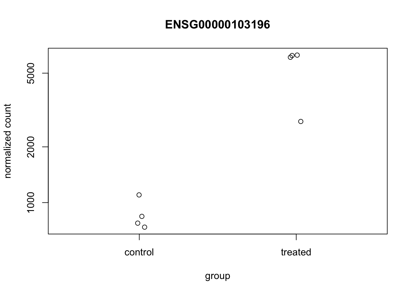
That’s just okay. Keep looking at the help for ?plotCounts. Notice that we could have actually returned the data instead of plotting. We could then pipe this to ggplot and make our own figure. Let’s make a boxplot.
# Return the data
plotCounts(dds, gene="ENSG00000103196", intgroup="dex", returnData=TRUE)

# Plot it
plotCounts(dds, gene="ENSG00000103196", intgroup="dex", returnData=TRUE) %>%
  ggplot(aes(dex, count)) + geom_boxplot(aes(fill=dex)) + scale_y_log10() + ggtitle("CRISPLD2")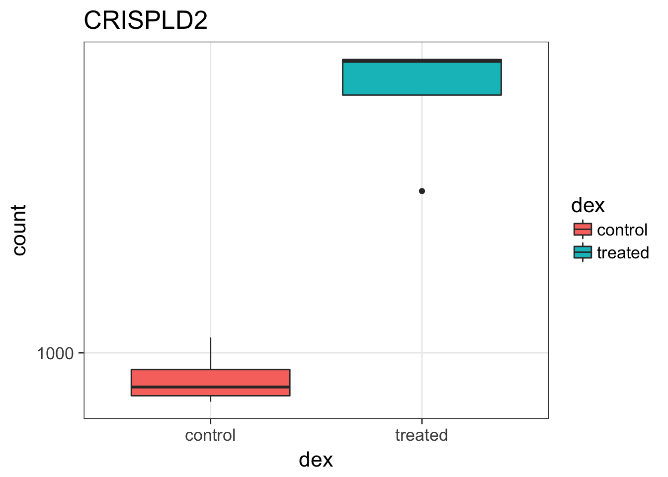
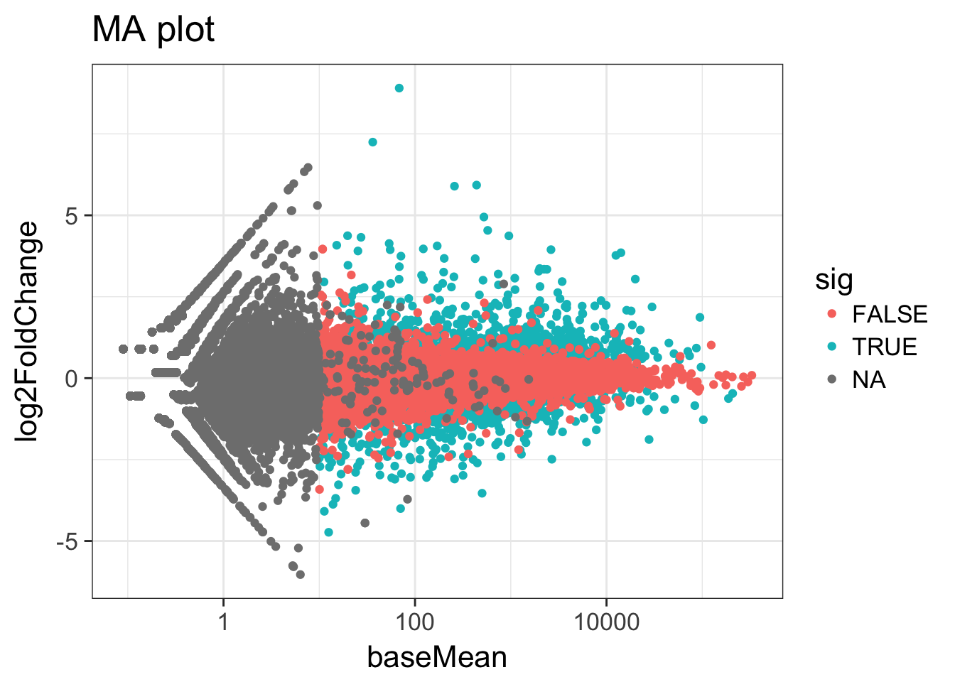
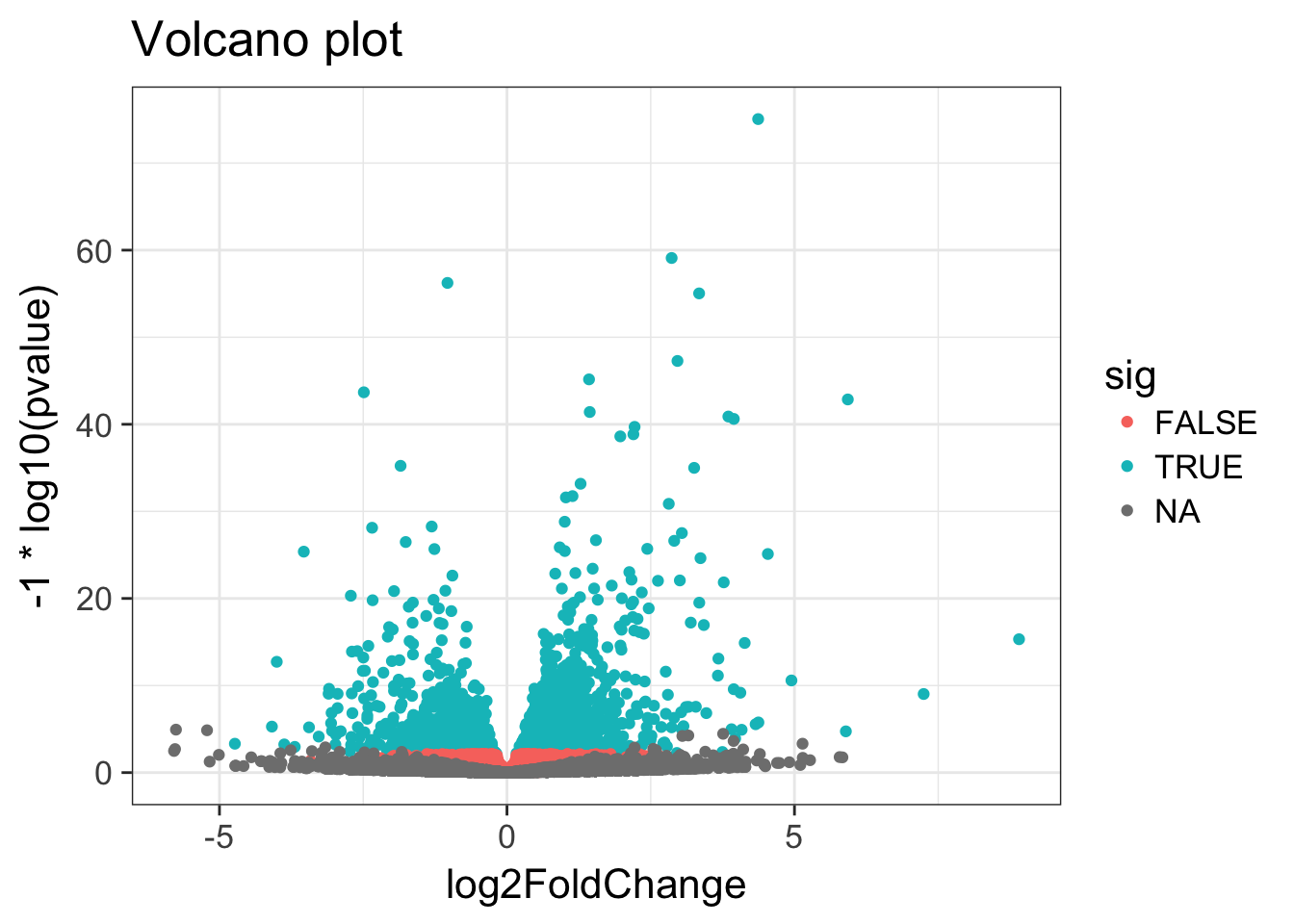
MA & Volcano plots
Let’s make some commonly produced visualizations from this data. First, let’s mutate our results object to add a column called sig that evaluates to TRUE if padj<0.05, and FALSE if not, and NA if padj is also NA.
# Create the new column
res <- res %>% mutate(sig=padj<0.05)

# How many of each?
res %>%
  group_by(sig) %>%
  summarize(n=n())
Exercise 5
Look up the Wikipedia articles on MA plots and volcano plots. An MA plot shows the average expression on the X-axis and the log fold change on the y-axis. A volcano plot shows the log fold change on the X-axis, and the \(-log_{10}\) of the p-value on the Y-axis (the more significant the p-value, the larger the \(-log_{10}\) of that value will be).
- Make an MA plot. Use a \(log_{10}\)-scaled x-axis, color-code by whether the gene is significant, and give your plot a title. It should look like this. What’s the deal with the gray points? Why are they missing? Go to the DESeq2 website on Bioconductor and look through the vignette for “Independent Filtering.”
- Make a volcano plot. Similarly, color-code by whether it’s significant or not.
Transformation
To test for differential expression we operate on raw counts. But for other downstream analyses like heatmaps, PCA, or clustering, we need to work with transformed versions of the data, because it’s not clear how to best compute a distance metric on untransformed counts. The go-to choice might be a log transformation. But because many samples have a zero count (and \(log(0)=-\infty\), you might try using pseudocounts, i. e. \(y = log(n + 1)\) or more generally, \(y = log(n + n_0)\), where \(n\) represents the count values and \(n_0\) is some positive constant.
But there are other approaches that offer better theoretical justification and a rational way of choosing the parameter equivalent to \(n_0\), and they produce transformed data on the log scale that’s normalized to library size. One is called a variance stabilizing transformation (VST), and it also removes the dependence of the variance on the mean, particularly the high variance of the log counts when the mean is low.
vsdata <- vst(dds, blind=FALSE)PCA
Let’s do some exploratory plotting of the data using principal components analysis on the variance stabilized data from above. Let’s use the DESeq2-provided plotPCA function. See the help for ?plotPCA and notice that it also has a returnData option, just like plotCounts.
plotPCA(vsdata, intgroup="dex")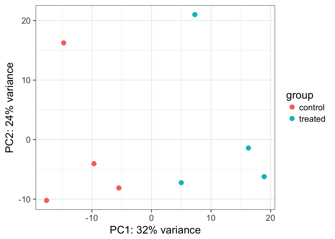
Principal Components Analysis (PCA) is a dimension reduction and visualization technique that is here used to project the multivariate data vector of each sample into a two-dimensional plot, such that the spatial arrangement of the points in the plot reflects the overall data (dis)similarity between the samples. In essence, principal component analysis distills all the global variation between samples down to a few variables called principal components. The majority of variation between the samples can be summarized by the first principal component, which is shown on the x-axis. The second principal component summarizes the residual variation that isn’t explained by PC1. PC2 is shown on the y-axis. The percentage of the global variation explained by each principal component is given in the axis labels. In a two-condition scenario (e.g., mutant vs WT, or treated vs control), you might expect PC1 to separate the two experimental conditions, so for example, having all the controls on the left and all experimental samples on the right (or vice versa - the units and directionality isn’t important). The secondary axis may separate other aspects of the design - cell line, time point, etc. Very often the experimental design is reflected in the PCA plot, and in this case, it is. But this kind of diagnostic can be useful for finding outliers, investigating batch effects, finding sample swaps, and other technical problems with the data. This YouTube video from the Genetics Department at UNC gives a very accessible explanation of what PCA is all about in the context of a gene expression experiment, without the need for an advanced math background. Take a look.
Bonus: Heatmaps
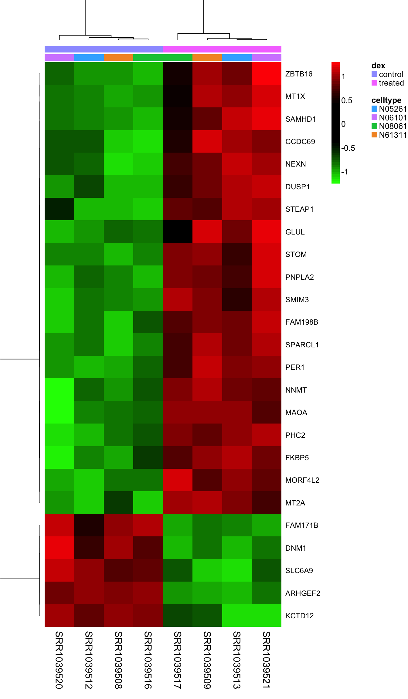
Heatmaps are complicated, and are often poorly understood. It’s a type of visualization used very often in high-throughput biology where data are clustered on rows and columns, and the actual data is displayed as tiles on a grid, where the values are mapped to some color spectrum. Our R useRs group MeetUp had a session on making heatmaps, which I summarized in this blog post. Take a look at the code from that meetup, and the documentation for the aheatmap function in the NMF package to see if you can re-create this image. Here, I’m clustering all samples using the top 25 most differentially regulated genes, labeling the rows with the gene symbol, and putting two annotation color bars across the top of the main heatmap panel showing treatment and cell line annotations from our metadata. Take a look at the Rmarkdown source for this lesson for the code.
Record sessionInfo()
The sessionInfo() prints version information about R and any attached packages. It’s a good practice to always run this command at the end of your R session and record it for the sake of reproducibility in the future.
sessionInfo()Pathway Analysis
Pathway analysis or gene set analysis means many different things, general approaches are nicely reviewed in: Khatri, et al. “Ten years of pathway analysis: current approaches and outstanding challenges.” PLoS Comput Biol 8.2 (2012): e1002375.
There are many freely available tools for pathway or over-representation analysis. Bioconductor alone has over 70 packages categorized under gene set enrichment and over 100 packages categorized under pathways. I wrote this tutorial in 2015 showing how to use the GAGE (Generally Applicable Gene set Enrichment)2 package to do KEGG pathway enrichment analysis on differential expression results.
While there are many freely available tools to do this, and some are truly fantastic, many of them are poorly maintained or rarely updated. The DAVID tool that a lot of folks use wasn’t updated at all between Jan 2010 and Oct 2016.
UVA has a site license to Ingenuity Pathway Analysis. Statistically, IPA isn’t doing anything revolutionary methodologically, but the real value comes in with its (1) ease of use, and (2) highly curated knowledgebase. You can get access to IPA through the Health Sciences Library at this link, and there are also links to UVA support resources for using IPA.
This summary report is the first thing you would get out of IPA after running a core analysis on the results of this analysis. Open it up and take a look.
It shows, among other things, that the endothelial nitric-oxide synthase signaling pathway is highly over-represented among the most differentially expressed genes. For this, or any pathway you’re interested in, IPA will give you a report like this one for eNOS with a very detailed description of the pathway, what kind of diseases it’s involved in, which molecules are in the pathway, what drugs might perturb the pathway, and more. If you’re logged into IPA, clicking any of the links will take you to IPA’s knowledge base where you can learn more about the connection between that molecule, the pathway, and a disease, and further overlay any of your gene expression data on top of the pathway.

The report also shows us some upstream regulators, which serves as a great positive control that this stuff actually works, because it’s inferring that dexamethasone might be an upstream regulator based on the target molecules that are dysregulated in our data.
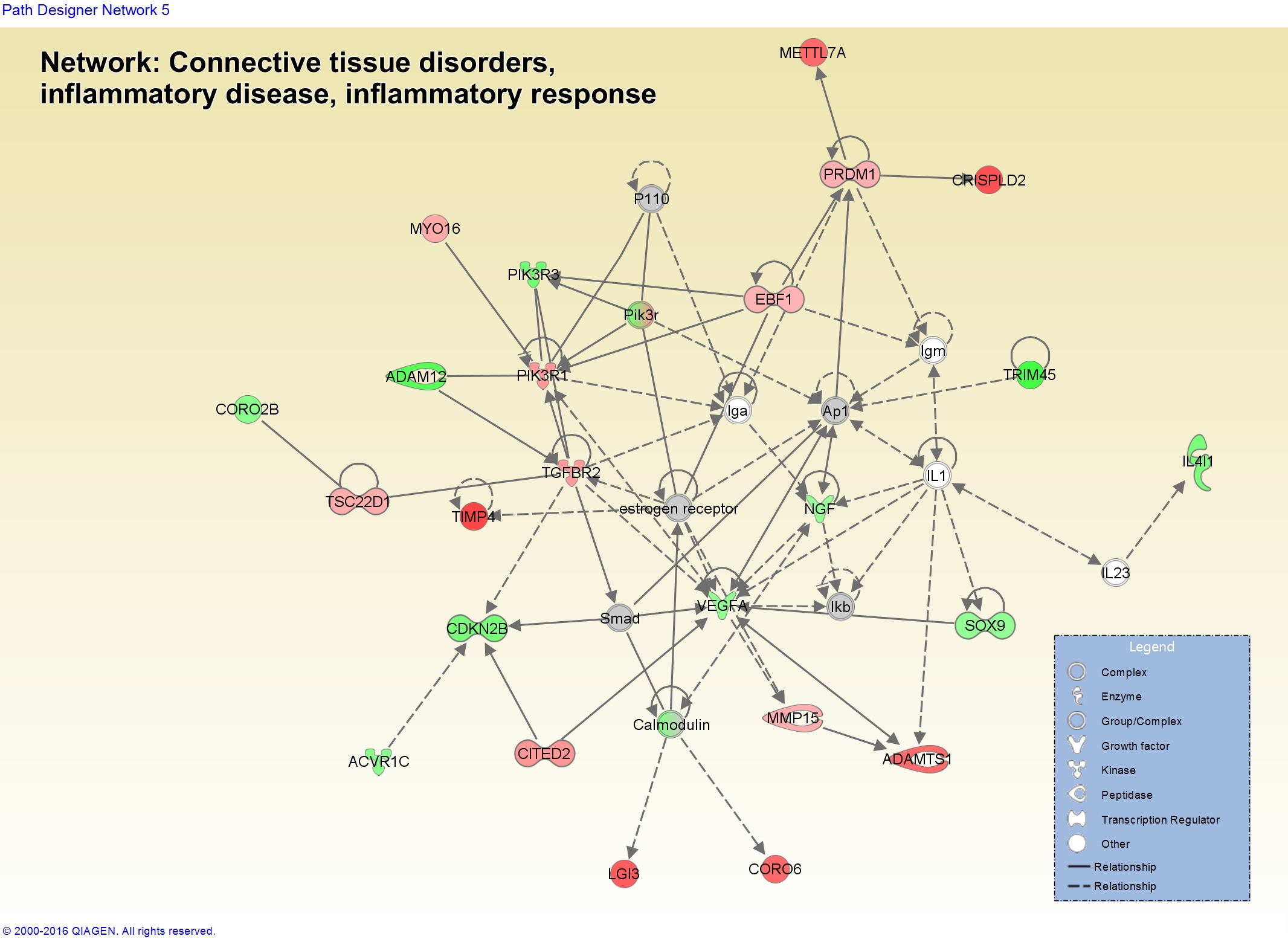
You can also start to visualize networks in the context of biology and how your gene expression data looks in those molecules. Here’s a network related to “Connective Tissue Disorders, Inflammatory Disease, Inflammatory Response” showing dysregulation of some of the genes in our data.
This only works when using the argument
tidy=TRUEwhen creating theDESeqDataSetFromMatrix().↩Luo, W. et al., 2009. GAGE: generally applicable gene set enrichment for pathway analysis. BMC bioinformatics, 10:161. Package: bioconductor.org/packages/gage.↩